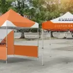
Did you know approximately 80% of people respond to print ads instantly, but just 45% respond to digital ads immediately (Potochny, 2017)? That’s clearly an indication of how important it is for businesses to use print ads such as banners or flags for marketing their products. Banners are one of the most useful methods to catch the attention of your target audiences.
Print ads are perfect for businesses as they require 21% less cognitive effort for your users to process. This is a great hand in propelling your message to your customers as they can resonate with your ideas without thinking much. Banners are retained in your customer’s mind like a sticker for a longer time, and thus have a significantly larger impact. Moreover, they are perfect for targeting a certain demographic audience for your business plans. So, let us explore all the hacks that will help you accelerate your marketing realm and propel your message right into the spotlight!
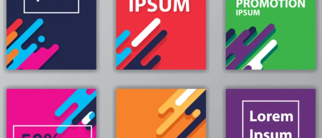
1. Crystal Clarity: Illuminate Your Message, Ignite Curiosity!
When it comes to banner design, clarity isn’t just an afterthought; it’s the spotlight that illuminates your message. Keep it crisp, concise, and captivating. Ditch the clutter, embrace the power of simplicity, and leave your audience craving for more. Remember, the art of clarity is not just about being seen but being memorably seen, leaving an indelible mark in the minds of your audience.
2. Vivid Vibes: Splash Bold Colors, Make Heads Turn!
Custom banners are your canvas, and bold, vibrant colors are your paint. Dive into the psychology of color, choose hues that resonate with your brand, and let them dance across your banner. The result? A visual symphony that captures attention and leaves an indelible mark. Understand the emotional impact of colors on your target audience, making your banner a visual feast that triggers positive responses and reactions.
3. Font Finesse: Typography that Whispers Elegance, Screams Impact!
Fonts aren’t just letters; they’re the silent heralds of your brand personality. Opt for readability and bold elegance. Your font should command attention from a distance, a visual embodiment of your brand’s charisma. It’s not just about what you say; it’s about how you say it. Experiment with font sizes and styles to find the perfect balance that communicates authority and captures the essence of your brand voice.
4. Picture Perfect: Sharp Images that Speak a Thousand Words!
In the world of custom banners, pixelated images are the equivalent of a mumbled speech. Choose visuals that are not just seen but felt. High-resolution images speak volumes, conveying professionalism and capturing the essence of your message with stunning clarity. Invest time in curating or creating images that tell a story, creating an emotional connection with your audience and leaving a lasting impression.
5. Whitespace Wonders: Balance in the Breaths Between!
Whitespace isn’t empty; it’s the silent conductor orchestrating the visual symphony of your banner. Don’t crowd your space; let the elements breathe. Whitespace guides your audience’s eyes, giving your message the spotlight it deserves. It’s the art of balancing information and leaving an impact. Experiment with different spacing techniques to find the perfect harmony that guides the viewer’s gaze through your banner effortlessly.
6. Brand Ballet: Dance of Consistency in Every Design Move!
Your banner isn’t just a canvas; it’s a brand ballet. Ensure every move is consistent—colors, fonts, and design elements should dance in harmony. Consistency builds trust, and trust is the bridge connecting your audience to your brand’s soul. Infuse elements of your brand’s personality into every design decision, creating a visual language that resonates with your audience and builds a lasting connection.
7. Simplicity’s Symphony: Less is More, More is Lost!
In the realm of banners, less isn’t just more; it’s a powerful statement. Resist the urge to overwhelm. A concise message leaves a lasting impression. Strive for the perfect balance between providing information and maintaining intrigue. Let simplicity compose a symphony of engagement. Simplify your message without sacrificing depth, allowing your audience to absorb the essence of your communication effortlessly.
8. Viewing Vistas: Designing for the Eyes That Wander Far!
Understand where your banner will stand; design accordingly. Whether it’s a vinyl banner on a building facade or custom flags fluttering at an event, the viewing distance shapes your design choices. Your banner should be a visual beacon that beckons from afar, drawing eyes to your message. Consider the environmental factors and optimize your design to catch the attention of passersby, making your banner a compelling focal point.
9. CTA Choreography: Dance of Action, Choreographing Conversions!
A advertising banner without a call to action is like a dance without a finale. Guide your audience’s steps with a compelling CTA. Whether it’s a website visit, a purchase, or an event attendance, choreograph the steps you want them to take. Make your call to action an irresistible dance of engagement. Craft CTAs that not only tell your audience what to do but inspire them to take the desired action, transforming your banner into a seamless part of their customer journey.
10. Endurance Elegance: Weather the Storm, Shine On!
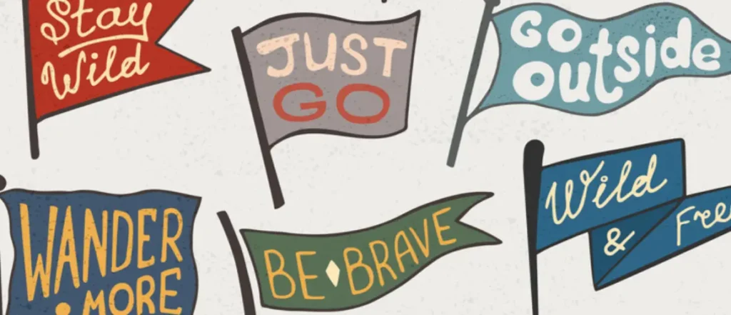
Banners aren’t just for the moment; they’re for the long haul. Choose materials that withstand the elements. A weather-beaten banner dims your message. Invest in materials like vinyl that not only endure but shine, ensuring your message stands resilient against the winds of time. Consider the long-term impact of your banners, opting for materials that not only survive weather conditions but maintain their visual allure, allowing your message to shine brightly through changing seasons.
In the competitive realm of advertising, banners aren’t just visuals—they’re storytellers. Apply these 10 banner design hacks, and watch your visuals transform into captivating narratives. Your message deserves the spotlight, and with these tips, your banners will command attention and affect your audience. So, embrace the design stage, let creativity flow, and witness your banners speak volumes without saying a word. After all, in the world of advertising, a well-designed banner speaks louder than words, and a durable one ensures that your message continues to resonate for the long haul.
Written By










 Posted in
  Tags:
Tags: 