Be sure your signs and banners say what you want them to say!
Fortunately, we can learn from the mistakes of others!
the most common
reasons for
sign fails is in
the copy layout.
You have good copy, right? And it all makes sense on paper, right? Remember, though, that how the copy is laid out on your banner or sign is VERY important!
Take a look at the examples below.
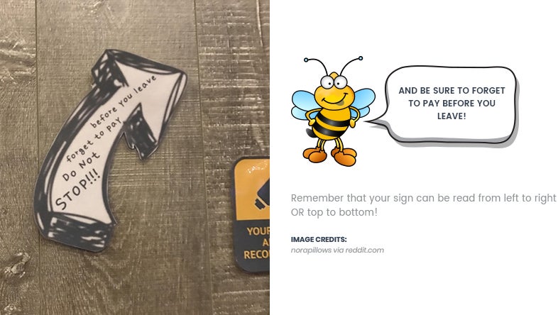
DO NOT STOP!
Yummy Children
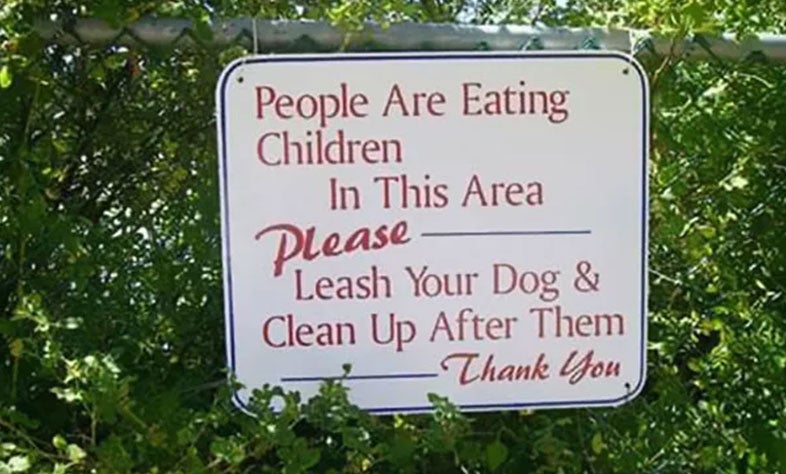
anditstonedme via reddit.com
Okay, so you have two thoughts you want to get across. Be sure they’re in the right order! And watch that layout. Read your ENTIRE sign as a sentence before finalizing your design.
Double Trouble
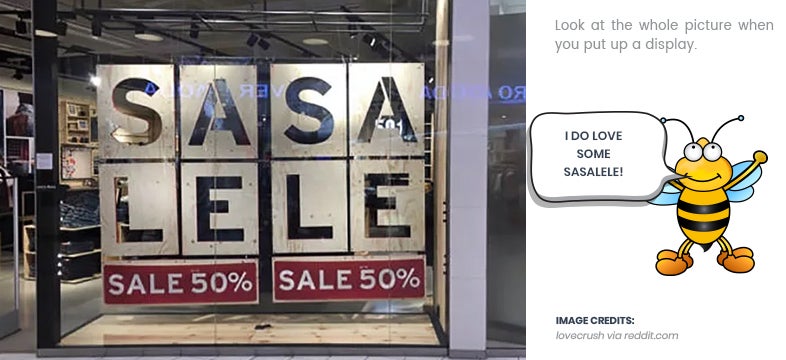
There’s really just no excuse for this one.

Dare not to dream
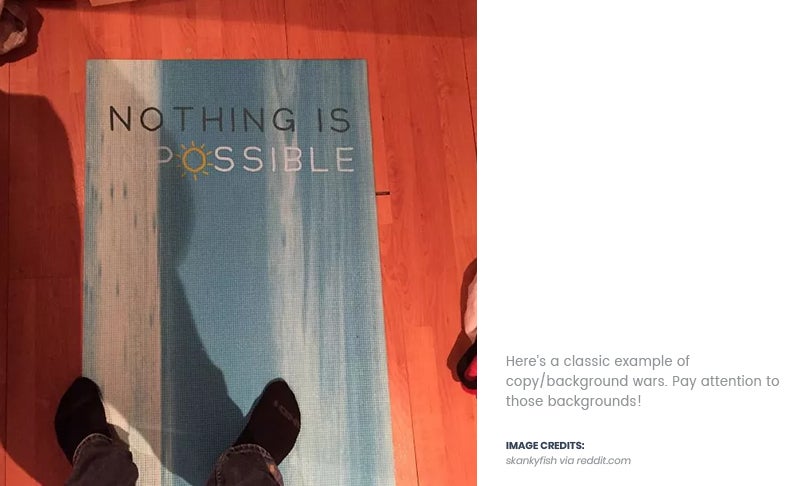

Your banners and displays should go viral for the right reasons!
For more fun sign and banner fails, check this link from Blazepress!




 Posted in

