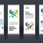
Amidst a variety of competition surrounding you, a banner that grabs the most attention is the one that wins an eye candy. Designing a banner that enhances the chances of seeking attention from more viewers can be thought provoking. Lets pinpoint inside the human brain; a place where the fundamentals of attraction first begin.
So what is it that our human eye finds most attractive? Maybe the universal laws of attractions can help us get the answer. Playing with symmetry, color and shape – the 3 supporting pillars might do the trick to the human eye.
a) Symmetry a balance where arrangement is similar on both sides ensures that one has nice lines and formed structure. Science says human brain is attracted to symmetry whereby it signifies superior composition.
b) Since color often defines the tone of the message, choose it very wisely. At times it can mislead a message as well as a right color helps bring life to the banner. Here is a chart that depicts the use of various colors and what generalized message does it convey.
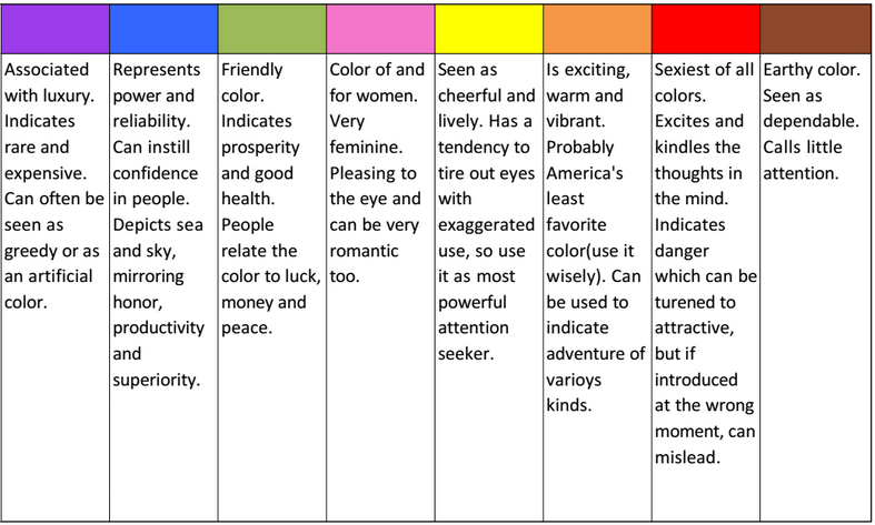
Fig: Different colors and their tones
c) Shape being one of the most important characters defining your banner. This factor can tickle the brain nerves the most. One can get highly creative with each use of shapes. Most common shapes used are geometrical. Though, one can give unique edge to the banner by strategically including shapes in their banner design. Banners can be shaped on the exterior as:
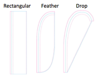
Fig: Most common banner shapes
But one can always create an illusionary effect using a shape inside a shape. This can either stand out or mar the concept. Here is an amazing example by monarch resort and spa of illusion created for a shape inside a shape.
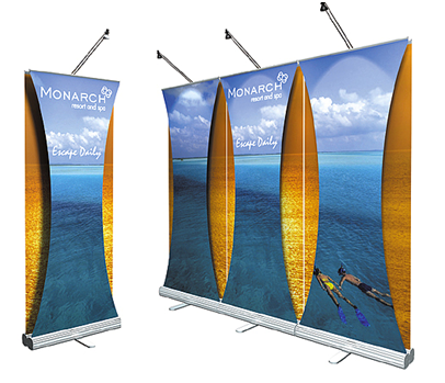
Fig: Illusionary effect of an arc shape inside rectangular flag
Often the shape defines the mood and message of the banner. Curvy and rounded surfaces are seen differently than sharp edges.Nevertheless rectangular banners are the most common and standard form used by the customers all over. Feather and teardrop banner can be used in areas where there is high wind intensity, since its shape allows a good visibility of fonts and flash during movement. Does not produce flapping noises either.
The universal laws of attraction thus not only help us define our fascination towards beautiful people, but indeed aide in designing banners that are beautiful to the human eye. After all, attraction is a part of the marketing gimmick!











 Posted in


