One may think that digital channels have eliminated the demand and relevance of traditional marketing. So, put a halt to the billboard printing and shelve those banner stands. After all, the whole world is online now, isn’t it?
Not really.
Because in what appears to be a striking contrast, you have companies like Google and Spotify stepping out of the virtual world and establishing their presence in the physical realm through billboards and banners!
It just goes to prove that billboards are evergreen. However, keeping up with the changing trends is the trick to maintaining relevance and freshness. How can you achieve this feat? Here are some ways:
Think Outside the Box
Rather than limiting your creativity within the confines of the billboard, feel free to go above and beyond to make a lasting impact.
Coop Paints achieved this effect with a billboard featuring an upset paint can. The “spill” covered the entire area – even the cars placed beneath the billboard.
Mammoth Mountain resort had a plain white billboard depicting the snow, and right above it, you could see a human cutout snowboarding!
The sheer shock value of watching something fly out of bounds leaves behind a memorable impact.
So, feel free to break out from the mold and print billboards and banners that veer off the trodden path. Go on, don’t be such a square – literally!
Strategize Placement
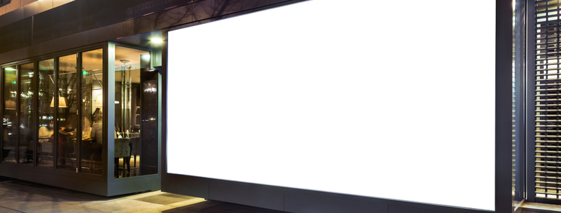
Your billboards are just as effective as the place where they are set up.
For instance, say you are advertising your eatery in a commercial area. This approach is great as it allows your brand to make a home in the minds of those who regularly commute past it (or even better – they are stuck in a traffic jam).
However, what if your eatery is located so far off that it just doesn’t seem like it is worth the detour? Clearly, something is amiss! And so, factor in the geographical location of the billboard, your store, and the traffic while working out the positioning.
Involve the Surroundings
Speaking of the location of your billboard, you can always integrate your surroundings strategically to make the entire setup stand out.
As an example, Koleston Naturals put up a billboard where the hair of a model was cut out. The changing backdrop gave the model an array of hair colors – effectively making the message loud and clear: whatever your hair colors needs may be, Koleston can deliver.
Similarly, Oldtimer Restaurants put up a billboard around a tunnel entrance, which made it appear as if all the cars were entering the model’s mouth!
Keep it Simple
So far, we’ve talked about the appearance and location of the billboard. Now, we get to its lifeblood – its content.
Craft a message that is succinct, impactful, and value-driven. You may even have to tweak it depending on the billboard’s placement and specifications.
Say, if it were to be placed around the highway, you would keep it short and simple so that even those zooming past the billboard can register it.
Similarly, if the billboard is at a considerable height, the letters would have to be proportionately larger, which means that you would once again have to condense the message to its shortest, most meaningful form.
Be Relatable
Relatability is another component of your billboard design. What you print on the billboard needs to be relatable enough for audiences to offer it real estate inside their minds.
Lately, Spotify has been in the news for its funny and witty billboards mushrooming around the world. What truly makes it stand out is the fact that each of them is customized for the location and/or the target audience.
The brand achieves this effect by analyzing large volumes of user data. The resulting minor adjustments make the billboard relatable to the extent that it resonates strongly with the masses.
Connected Experiences

Who said printed billboards can’t be fun?
Take the ad for Mars Chilled (yes, it was a thing), which used two closely-located billboards. One had a bar of Mars Chilled, and stuck to it was a tongue originating in the mouth printed on the second billboard.
While such illusions were nothing short of black magic in those days, achieving such effects is easier with digital billboards.
In fact, Oreo ran a campaign where an Oreo cookie was passed around – from one billboard to another – all through Times Square.
Add a Splash of Colors
Finally, colors are the easiest way to draw attention to your billboard. Pick loud and bold colors as they will be more noticeable from distances.
Further, certain colors induce certain emotions. Say, red builds a sense of excitement and adds to impulsiveness. On the other hand, blue builds trust and promotes peace.
Pair the color psychology with contrast to play around with background and text combinations that make the message pop. It will grant it higher visibility and make it more readable.










 Posted in