In today’s ever-evolving digital landscape, embracing the latest trends is a key step to hook in visitors. While it might not be feasible to incorporate all of these trends to build an effective website, adding even a few of them can improve your website UX significantly, thus leading to higher engagement and a better outcome for your business. Want to get started getting your website up to snuff? Try incorporating one of these top design trends for the coming year.
Three-Dimensional Design Elements
One of the latest trends to emerge over the past few years is to incorporate 3D design into your website. 3D elements, such as real-life web models to photo illustrations, create a visual world for your visitors to enter in. 3D elements may also include animations, shadows, or layered effects to add depth and dimension to your site.
The current vogue is to incorporate various 3D elements with a flat, clean 2D design. The clean design allows for a simple layout to explore, while using 3D elements to deepen the immersive experience. 3D elements can be expanded to create robust visual storytelling, allowing you to capture your history, product, or promotional items with a clear pop.
Comfortable Colors

Traditionally, web designs have always focused on bright, high-contrast color design. However, contemporary design is shifting to the use of softer color palettes. Soft palettes offer a break to the eyes from the bright whites of typical website designs.
When using a more homely color palette, it’s still important to focus your aesthetic on your brand’s image. Choosing the right set of pastel blues or warm and natural greens will not only help you draw the user’s focus, but create a strong association between color and brand.
Horizontal Scrolling
Vertical scrolling is the norm for web design. However, horizontal layouts have recently taken off as an alternative. The key benefit of horizontal scrolling is its simplicity, while breaking away from the familiar. Likewise, horizontal scrolling creates active participation from the user, keeping them more interested and engaged through layout alone.
Much like flipping the pages of a good book, horizontal scrolling creates clean breaks between sections, allowing for exciting interactions between texts and images. Horizontal scrolling is also a practical and functional layout for mobile sites, where a clean swipe left is equally intuitive to a vertical scroll.
Return to Minimalism
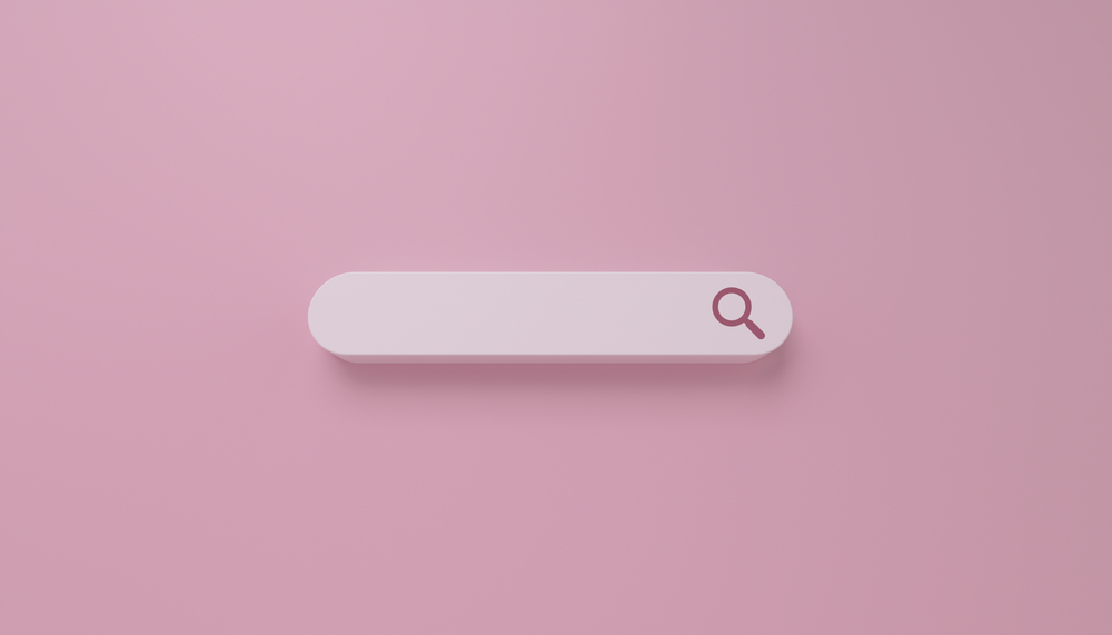
The core concept of a Minimalist web design is to make use of soft colors and the fewest design elements possible. Minimalist websites utilize white spaces, flat spaces, muted colors, and prioritize a clean look. Minimalism comes from the age of Google, a response to the gaudy banner ad pages of the late 90s. However, minimalist designs have made a return in contemporary web design, integrating modern features with clean layouts.
Minimalism is a less-is-more approach, meant to prioritize a simple, friendly user experience over spectacle. It’s important to note that minimalism, while an aesthetic choice, is primarily a philosophy. You can take a minimalist design approach while integrating elements of other web design trends. Complex design elements such as 3D can be integrated into a minimalist layout as long as you avoid cluttering the space.
Neo Brutalism
Brutalism harkens back to the Brutalist architectural movement: a mid-twentieth century movement that emphasized exposing the raw materials and architectural elements from construction in design. When applied to the web, Brutalism emphasizes plain backgrounds, default computer fonts, asymmetrical layouts, and unfiltered photos.
This digital Brutalism started as a radical design trend in the mid 2010s, but in 2022, is morphing into a more refined form, known as Neo-brutalism. Neo-brutalist designs use many of the same stark effects, while focusing more on the overall intent and function of the design. This approach creates a striking atmosphere that demands the audience’s attention.
Retro Fonts
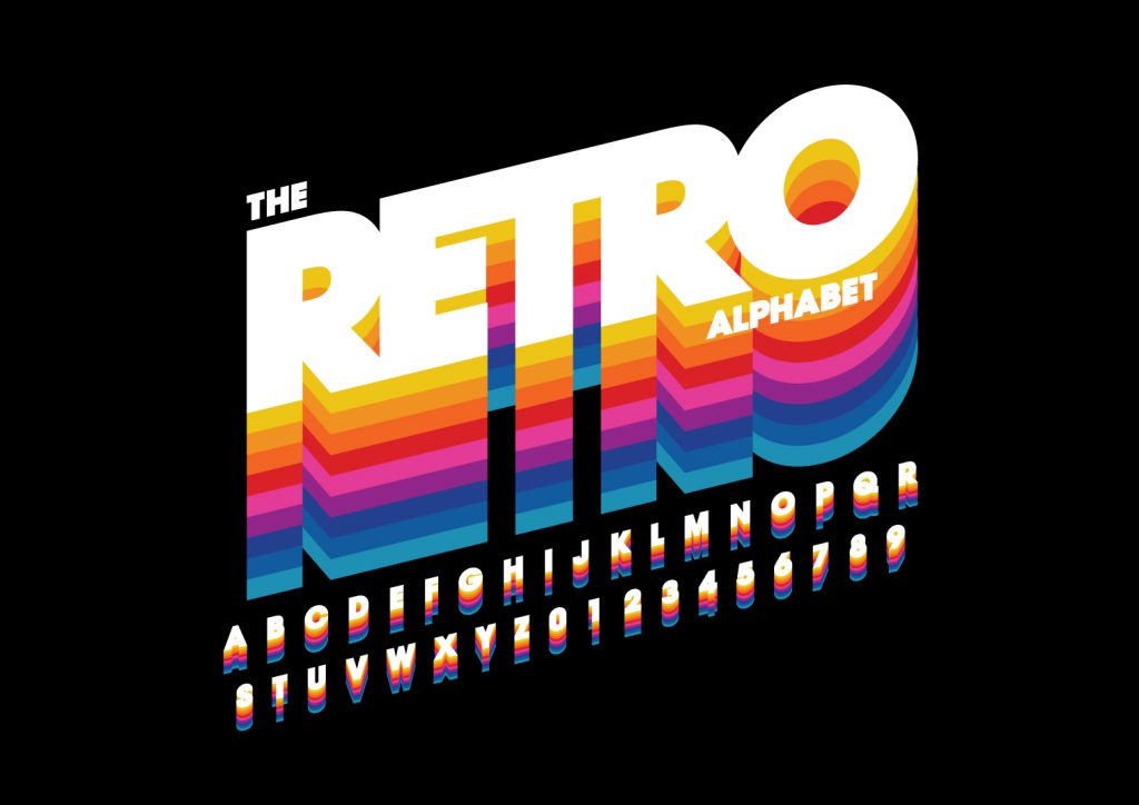
With centuries of media sitting at their fingertips, digital natives such as Millenials and Zoomers are highly interested in retro and nostalgia. Likewise, vintage-inspired colors and typography are hot design trends. From bold and beautiful to campy and vintage, retro fonts can add a great appeal and character to any website’s layout.
Likewise, current design has moved to an era of experimentation in font style and size. Along with utilizing distinct fonts, designers have experimented with layering, shading, and floating text to make these fonts a centerpiece of the page. To fully capitalize on this trend, treat your text like images and shapes: yet another piece in the visual palette to draw the eye of potential visitors.








 Posted in