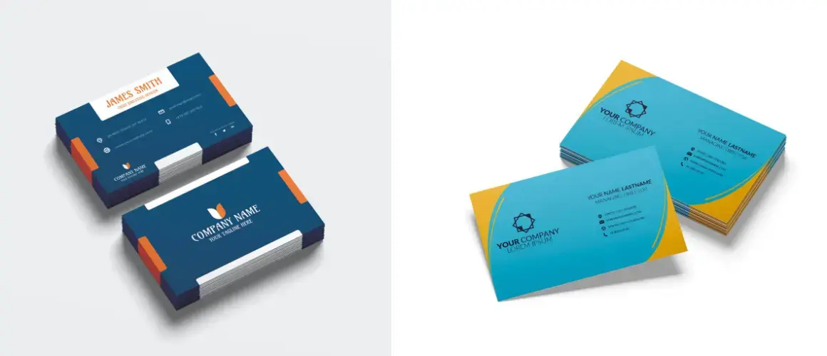
With humble beginnings in the 15th Century, the all-important business card has come a long way. From a casual networking tool to an essential introduction medium, the custom business card does it all. In the 21st century, a personalized business card is part of the gamut of ‘must-have’ things for professionals from all fields of life.
But what does that card say about its owner? Let’s find out.

Color
We see color around us everywhere, from nature to buildings and everything in between. We might not realize it, but colors play a very important role in helping us form opinions, the very same thing that a business card also aims to achieve.
Here’s how colors on a business card can be interpreted
Blue: The color of honesty and trust. A blue business card indicates the person can be trusted and is not likely to cause trouble in case you decide to give them a crucial project or contract. A darker shade of blue indicates the person is authoritative and can take charge of responsibilities, whereas a lighter shade, reflects the person is good at following directions.
Red: Indicating aggression and passion, Red is the color for people who are full of enthusiasm and are brimming with energy. However, too much use of the color can send wrong signals, in terms of an angry disposition and a vengeful nature.
Green: The color of balance, growth, and security, Green indicates the person is compassionate and has a balanced sense of nurturing and professionalism. When you receive a green-colored business card you can be sure the person will be a great company.
Black: Perhaps the most common color used on business cards, maybe because it indicates seriousness and authority. However, too much use of black can indicate intimidation and an overly aggressive nature that you should steer clear of.
Paper
When someone hands you their business card and you touch it for the first time, there’s a split second when your mind subconsciously takes note. This is that ‘impression’ that everyone seems to be talking about and the quality of the paper is the first thing that can make or break your image.
GSM: We know the higher the GSM the better quality of paper you will get. But what does this mean for a business card? It means the print translates better on paper and leaves the receiver with a good impression of your professionalism.
Crisp & Firm: No one likes receiving a flimsy, bendy business card as it shows the callousness of a person. A firm card will tell you the person takes his/her image seriously and will not cut corners at work.
Laminated Paper: This Shows the person is penny wise and makes an effort to get the best bang for his buck. However, the laminated paper also shows a disregard for others since writing on it is not very easy.
Font
The readability of the text is influenced a great deal by the use of fonts and it is the right use of these fonts that also help create a positive impression in the minds of people. In the case of business cards, it’s crucial to choose the right font and its size so that your networking has the desired effects.
Highly Decorative Fonts: While these fonts may add a touch of sophistication to your business card but it also shows the person is a show-off that can adversely affect the way you are perceived.
Clean Fonts: A clean and clear font indicates the person is in control and commands respect. These sorts of people are highly motivated and have a high level of professionalism.
Logo
A brand’s logo is the embodiment of its values and getting this right on a business card is absolutely crucial. The way a logo is placed says a lot about the company and its people.
Too big: If the logo is in-your-face it means the brand is very eager for attention, while that is good for business but psychologically it sends a signal about not being trustworthy.
Too Small: A small logo indicates the brand lacks confidence and is relying heavily on luck to grab attention. These brands may offer better value for money but in the longer, term, doing business with them might prove costly.
No Logo: Getting a business card from someone without a logo should ring alarm bells right away. No logo means, no credibility – It’s that simple.
Orientation
Vertical or Horizontal? This question has baffled many professionals of late and with no right answer, it gets difficult to choose. So what does the orientation of your business card really mean?
Vertical: Modern, progressive, and free thinker. These qualities are admired by new-age clients and customers. Having a vertical business card confirms that a person is not afraid of taking risks and will tackle challenges head-on.
Horizontal: While this is the traditional orientation of a business card and has been used for centuries, if used correctly it reflects a person’s confidence and shows they know what they’re talking about.
Size
Size really matters when it comes to business cards and the right size determines if your card will do its job or go unnoticed amongst the others
Standard Size: It shows the person will not go out of their way to complete a job. An important trait if you’re selecting vendors or looking to give out contacts.
Small: Lack of confidence in their abilities and may even not be as good as they say.
Big: Overconfident and pompous, an extraordinarily large business card is a sure sign
of attention-grabbing which is not always a good sign.


 Posted in
  Tags:
Tags: 


